The difference between a beautiful aquascape and a forgettable one usually isn't equipment, expensive plants, or rare rocks — it's composition. The same materials, arranged with attention to a few design principles, look transformatively different. These principles come from photography, landscape design, and visual art, and they apply directly to the underwater canvas. Here's the complete guide to the composition rules every aquascaper should know.
At a glance: the principles
| Principle | What it asks of you |
|---|---|
| Rule of thirds | Put the important elements on a 3×3 grid's lines or intersections — never the biggest rock dead centre |
| Golden ratio | The more sophisticated version: roughly 1.618:1, giving a "golden point" to build around |
| Focal points | One main one, with a secondary on the opposite third for balance |
| Depth and perspective | Slope, plant heights and open space, all working to make a shallow box read as a landscape |
| Negative space | What you leave empty rests the eye, emphasises the focus, and suggests scale |
| Asymmetric balance | Balanced, not mirrored — symmetry reads as artificial |
| Texture and colour contrast | Fine against coarse, and a restrained palette rather than everything at once |
| Lines and visual flow | Where the eye enters the scene, and where it travels |
A symmetric central composition feels static and artificial — like a passport photo of your tank rather than a landscape.
Why Composition Matters
A tank with thrown-together elements looks "fine" — but a tank with the same elements composed thoughtfully looks beautiful. The difference is composition: how the elements relate to each other, where the eye is drawn, how depth is created, what feels balanced vs. chaotic.
The good news: composition can be learned. The principles below take some practice to apply but are straightforward to understand. Once you train your eye, you'll start seeing them in great aquascapes — and noticing their absence in mediocre ones.
The Rule of Thirds
The most fundamental composition principle in any visual art form, and directly applicable to aquascaping.
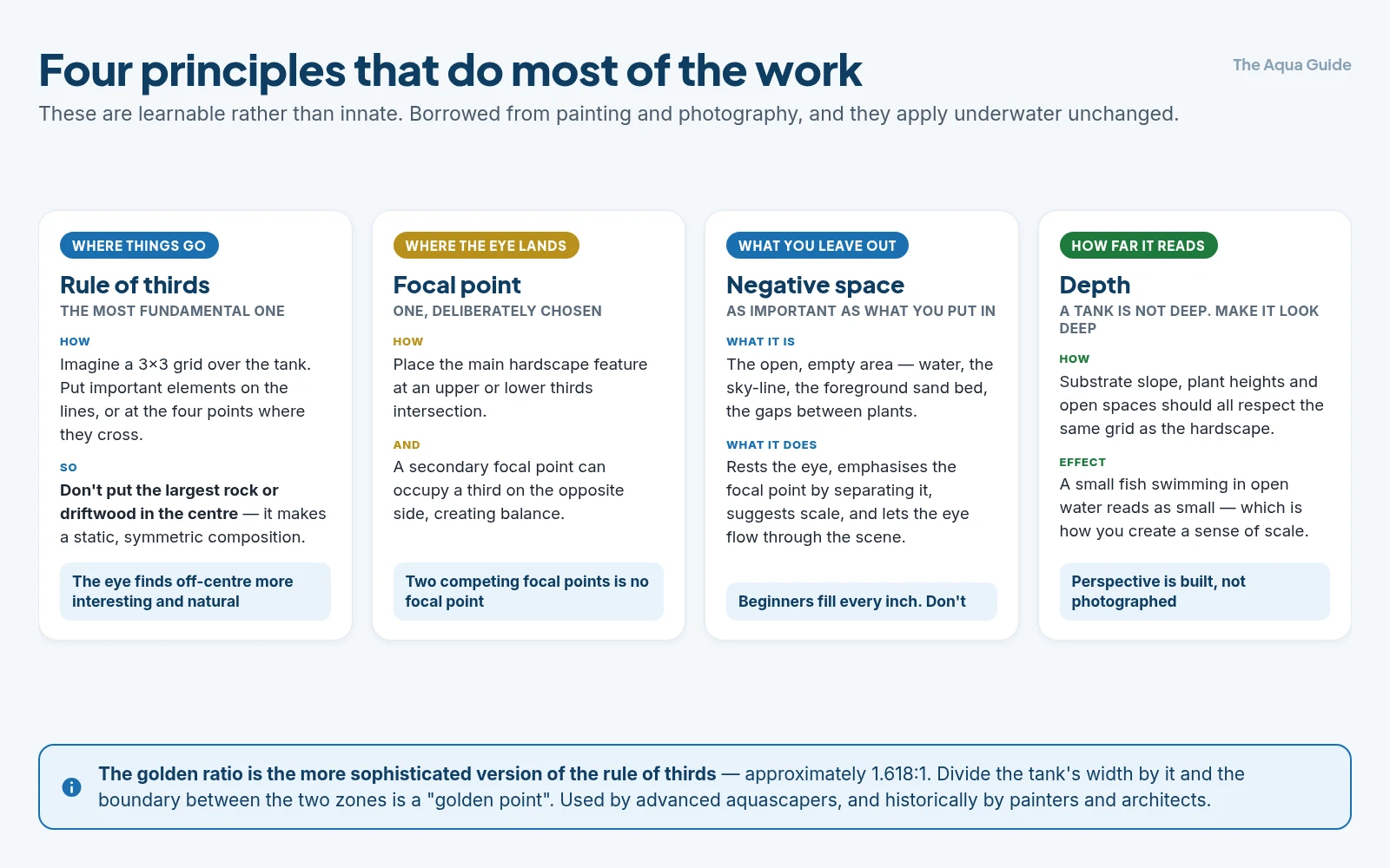
How it works: Imagine your tank divided into a 3×3 grid — two horizontal lines and two vertical lines. The four points where these lines intersect are the "rule of thirds" points. Important elements (focal points, hardscape, key plants) placed at or near these intersections feel more visually balanced than the same elements placed dead-center.
In practice:
- Don't put the largest rock or piece of driftwood in the center — it creates a static, symmetric, less-dynamic composition
- Place the main hardscape feature at one of the upper or lower thirds intersections
- Substrate slope, plant heights, and open spaces should also respect the grid
- A secondary focal point can occupy a third on the opposite side, creating balance
Why it works: The human eye finds off-center compositions more interesting and natural. Symmetric central compositions feel static and artificial — like a passport photo of your tank rather than a landscape.
The Golden Ratio
A more sophisticated version of the rule of thirds, used by advanced aquascapers and historically by painters and architects.
The ratio: Approximately 1.618:1, or 1:1.618. If you divide your tank's width using this ratio, you get two zones — one larger, one smaller. The boundary between them is a "golden point."
Applying it: A focal point placed at about 38% from one edge (or 62%, the complement) often looks more balanced than rule-of-thirds placement.
Honest assessment: For beginners, rule of thirds is enough. Golden ratio is a refinement that becomes useful at intermediate levels. Don't worry about the exact mathematics — both principles essentially say "off-center, near a particular position."
Focal Points
Every successful aquascape has a clear focal point — the spot the eye is drawn to first.
Creating a focal point:
- Largest or tallest hardscape element (the prominent rock or branching driftwood)
- Contrasting color (a single red plant in a green-dominant scape)
- Contrasting texture (a fine carpet meeting bold leaves)
- Lighting emphasis (the brightest area of the tank)
- Empty space leading toward it (paths, negative space draw the eye)
Avoiding focal point mistakes:
- Don't create multiple equal focal points — they compete for attention and confuse the eye
- Don't have no focal point — uniform composition is dull
- Don't place the focal point dead-center — apply rule of thirds
- Don't hide the focal point behind other elements
One strong focal point with everything else supporting it produces the strongest compositions. A secondary point at lower intensity can balance the design without competing.
Depth and Perspective
Aquariums are shallow rectangles — typically only 15–20 inches deep (front to back). Creating the illusion of depth is one of aquascaping's central design challenges.
Techniques for depth:
Substrate slope. Slope substrate upward toward the back of the tank — even a modest rise (2–4 inches higher at back vs. front) makes the scene feel deeper. Use rock barriers or substrate dividers to maintain the slope.
Foreground-to-background size gradient. Larger elements in front, smaller in back. The same plant species can be planted larger and fuller in the front, smaller and sparser in the back. This mimics how distant objects appear smaller in nature.
Color and clarity gradient. Brighter, more saturated colors in front; muted, blue-toned colors in back. Mimics atmospheric perspective in landscape painting — distant mountains appear bluer than close ones.
Texture density gradient. Fine textures in back (small leaves, dense carpets), bolder textures in front (large leaves, prominent stones).
Paths and openings. A path receding into the distance — through plants or between hardscape — creates a strong sense of depth.
Why it matters: Tanks without depth illusion look flat and small. The same tank with strong depth design feels like a window into a vast landscape.
Negative Space
What you don't fill with elements matters as much as what you do.
Negative space is the open, empty area in a scape — water, sky-line, the foreground sand bed, gaps between plants. It serves several functions:
- Provides rest for the eye in busy compositions
- Emphasizes focal points by separating them from competing elements
- Suggests scale (a small fish swimming in open water reads as small)
- Allows visual flow for the eye to move through the scene
- Mimics natural environments, which are rarely densely packed
Common beginner mistake: Filling every inch with hardscape and plants. The result feels cluttered and chaotic. The fix: deliberately preserve open zones.
Iwagumi style is the extreme example of negative space — large open foreground areas with just a few rocks and a low carpet. Even more crowded styles like Dutch and Jungle benefit from at least small areas of openness.
Asymmetric Balance
Symmetric layouts (mirror-image arrangements) look artificial and static. Asymmetric layouts feel natural and dynamic.
Asymmetric balance means visual weight is distributed unevenly but in a balanced way:
- A large rock on the left balanced by several small rocks or a tall plant on the right
- A dominant feature offset from center, balanced by lesser features
- Different element types balancing each other (a stone balanced by a piece of wood)
Visual weight is what matters — not literal size or quantity. A small bright-red plant can balance a large grey rock because color attracts the eye disproportionately.
Symmetry to avoid:
- A rock in the exact center
- Mirror-image arrangements (two identical rocks placed symmetrically)
- All elements equal size and similar positioning
Texture Contrast
Mixing different visual textures creates interest. All-similar textures create monotony.
Texture in aquascaping:
- Fine — moss, hairgrass carpets, fine-leaved plants
- Medium — most stem plants, sword leaves, many ferns
- Bold — large-leaved plants, anubias, lotus
- Smooth — smooth rocks, glass surfaces
- Rough — pumice, driftwood with deep grain, dragon stone
Effective contrasts:
- A bold-leaved anubias against a fine moss carpet
- Smooth rounded river rocks against jagged dragon stone (use one as anchor, not equally)
- A delicate hairgrass meadow with a few bold leaves emerging
Avoid: Mixing too many textures randomly. Pick 2–3 main textures and play them against each other.
Color Theory in Aquascapes
Color choice profoundly affects how a scape feels.
Limited palettes look better:
- Greens only, with variations in tone (lighter, darker, yellow-green, blue-green)
- Greens with one accent color (red, brown, orange) used sparingly for focal emphasis
- Earth tones (browns, tans, ochres) with green accents
Avoid: Mixing every color of plant available. The result usually looks chaotic and amateur.
Accent colors:
- A single small red plant (Alternanthera, Rotala) draws the eye like a magnet
- Driftwood brown contrasts beautifully with green plants
- Lava rock orange-red can serve as accent or focal hardscape
Cool vs. warm:
- Cool palettes (greens, blues) feel calm, distant
- Warm palettes (reds, browns) feel close, intimate, energetic
Most aquascapes work in a cool-dominant palette with small warm accents. This mimics most natural underwater scenes.
Lines and Visual Flow
The eye follows lines created by hardscape and plants. Use them deliberately.
Strong line directions:
- Diagonal — creates dynamism and movement
- Triangular — implies mountainscape; stable yet active
- Curving — natural, flowing; mimics rivers and streams
- Convergent — multiple elements pointing inward, drawing eye to focal point
Avoid:
- Purely horizontal lines (look static, like a flat horizon)
- Purely vertical lines (feel artificial unless used deliberately)
- Pointing OUT of the composition (the eye follows the line out of the tank)
Practical tip: When placing hardscape, think about where the eye is led. A piece of driftwood angled upward and inward draws the eye into the composition. The same piece angled outward and downward leads it away.
Compositional Layouts
Several classic structural arrangements:
Triangular (mountain) layout. Highest point on one side (often the focal point), gradually lower across the tank. The most common and reliable aquascape composition. Apply rule of thirds for the highest point's position.
Convex (hill) layout. Highest in the middle, lower at the edges. Less common; can work but easily looks symmetric. Use carefully.
Concave (valley) layout. Lower in the middle, higher at the edges. Creates a strong central focal area. Often features a "path" of substrate or low-growing plants down the middle.
Two-mountain layout. Two raised areas, one larger than the other (rule of thirds!). Beautiful when done well; tricky to balance.
For beginners: triangular is the safest start. Most successful first aquascapes follow this layout.
Putting It All Together: An Example
Imagine a 20-gallon long tank, working from these principles:
- Layout: Triangular, with the highest point at the left third (rule of thirds)
- Focal point: A large piece of branching driftwood angled upward at the left-third position
- Substrate: Aquasoil, sloped from 3 inches at front to 6 inches at back-left, creating depth and supporting the wood
- Plants: Hairgrass carpet in the foreground right side (negative space at left), medium stem plants behind the wood, taller background plants at the back
- Texture: Fine hairgrass + medium stems + bold wood + scattered moss on the wood
- Color: Predominantly green, with one small red Rotala bunch at the right-third (color accent, secondary focal point)
- Lines: Wood angling upward and inward, leading the eye to the focal point; substrate slope reinforcing the upward movement
That's not random — it's a deliberate composition applying multiple principles simultaneously.
Common Composition Mistakes
Centered focal point — looks static. Move it to a third.
Symmetric arrangement — feels artificial. Add asymmetry.
No focal point at all — eye doesn't know where to go.
Too many focal points — eye doesn't know where to settle.
Flat (no depth) — same height across the tank.
Cluttered (no negative space) — every inch filled with elements.
Random color mix — chaotic palette.
Lines pointing outward — leading the eye away from the scape.
Equal element sizes — no hierarchy; nothing feels primary.
Recognizing these mistakes in others' work — and then in your own — accelerates your aquascaping development.
The Bottom Line
Composition is what separates a good aquascape from a great one. The fundamental principles — rule of thirds, focal points, depth and perspective, negative space, asymmetric balance, texture contrast, color harmony, and visual flow — apply universally regardless of style. Beginners should focus on a few principles initially: place the main hardscape element at a rule-of-thirds point (not center), use a triangular layout with one dominant focal point, create depth through substrate slope and front-to-back size gradient, preserve some negative space, and limit your color palette. Don't try to apply every principle perfectly on the first attempt — composition skill develops by doing, observing, and iterating. Study competition aquascapes online, identify which principles they're using, and try variations in your own tank. Over time, what feels abstract becomes intuitive — and your aquascapes get noticeably better.
Related guides
- Aquascape styles: nature, iwagumi, Dutch, jungle
- Aquascaping for beginners
- Hardscape: choosing and placing rocks
- Hardscape: driftwood selection and placement
- Setting up your first aquascape, step by step
- Substrate choices for aquascapes
- Aquascape maintenance and evolution over time
- Aquarium photography: capturing your tank
Got questions about your specific setup? Drop them in our Community Forum — we love helping new fishkeepers get started right.